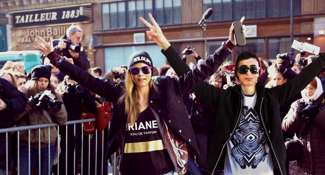
What did you choose the historic photo for your final composite with your photograph?
I chose a popular picture of supermodel Cara Delevingne, in which she is standing with the paparazzi behind her, and so I added my self into the photograph as well. I really like Cara, and I think she is very cool, so I decided that being in a picture with her, would be historical, fun, and cool.
What challenges did you have?
I had the challenge of cutting myself out just right to match the original photograph. It kind of took a while. Also, I had a problem with matching my skin tone in the picture, to the skin tone of Cara in the original picture.
How successful was is? I think it turned out very well, it almost looks like I was actually there.
What era of "vintage" do you feel drawn to? I am very drawn to the 1970's.